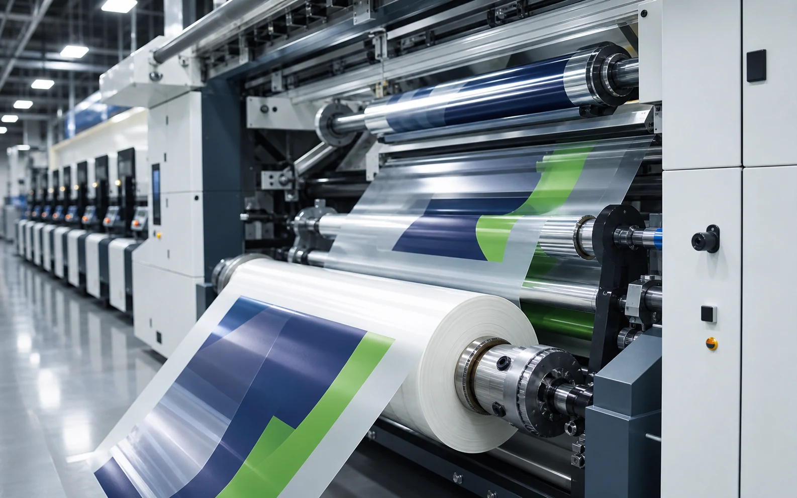
A strong packaging design must do more than look right on screen; it must reproduce consistently on press. In flexography, design, plate, ink, film and machine settings are connected.
1–3: Colour, solids and image preparation
Brand colours should have defined targets, with spot and process colours separated according to the production plan. Large solids, fine gradients and highlights are prepared for the selected anilox and plate conditions.
Images require sufficient resolution at final print size, and fine detail should be reviewed in proofing for its behaviour on film.
- Define colour targets and tolerances.
- Prepare solids and gradients for the print condition.
- Check image resolution at final size.
4–5: Type and barcode readability
Very small type, fine reversed text and low-contrast colour combinations can lose readability on press. Required product information belongs in safe areas within a clear hierarchy.
Barcode size, contrast, direction and distance from pack folds should be checked. Review samples in print and on the formed pack, not only on screen.
6–7: Repeat, cutting and approval
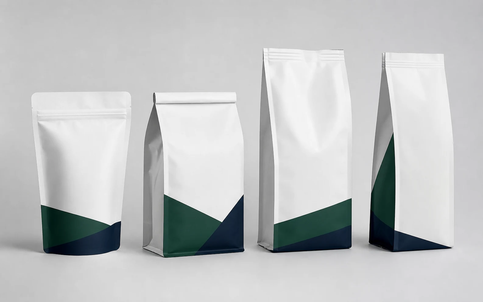
Print repeat, bag length, eye mark, seal and cutting zones should share one technical drawing. Critical artwork must not drift into seals or gussets.
Preflight, colour proofing and a press sample where practical clarify the approval chain. Version control prevents superseded artwork from reaching production.
Key takeaways
Seven Checks from Design to Flexographic Print
- Review artwork at actual print and pack size.
- Check barcodes and fine type on the formed package.
- Manage repeat, seal and cut zones in one technical drawing.